Initial Sketches, Steps & Layers of 3 Posters
- imogenwest98
- Feb 27, 2021
- 4 min read
Updated: Mar 13, 2021
Having now studied and analysed various secondary photos of orangutans, I was able to start sketching out my posters. Understanding that orangutans spend the majority of their lives in trees, I certainly wanted to represent them in this way - I also evidently knew this would create a significant contrast where showing the disastrous effects of deforestation, and what it takes away from the wildlife.
Where I was initially unsure about the composition and layout of this first poster, I took inspiration from the photos I took looking at the texture in wildlife. Photos showing natural framing around walkways and through hedges inspired me to apply that effect here, framing the orangutan in the centre and providing the opportunity to highlight what is most important to the Foundation.
Looking back to my blog researching into some common plants found in Malaysian rainforests, I was able to build different layers to the poster. I started with darker colours and shades to the background, as I wanted to set the scene and add some perspective. Adding vines and some more generic leaves too allowed me to fill some gaps in the background, to then be slightly covered by more detailed and relevant images.
Using layers on Procreate here was a really advantageous process, as I wanted layers and depth to be portrayed within the outcome - I was able to develop a range of plants and leaves whilst changing them as I went, altering sizes and appearances to suit the layout. Drawing in solid colours to set backgrounds for the different elements was how I started, adding textures and appearances with different brushes on top. I wanted the overall appearance to look realistic to an extent, with details and bright colours, but also to be a 'fun', approachable and easy-on-the-eye piece.
The second poster was a slightly simpler and more refined approach - I knew I wanted this poster to represent a solid dystopian element of the three together, and to act as a warning of what is both happening now and in the future, and why it needs to stop. I wanted to add perspective to the poster - starting by drawing an orangutan to the front and centre, huddled up and in a timid position, I sketched the forest to the background. I considered making the background coloured, as thats how the rainforests are, but I felt the beauty of them and the lives they habit is taken away when on the verge of being destroyed - they are no longer the safe environment for animals and species to live within.
In the first and third posters I have drawn orangutans with their babies, as the Orangutan Foundation very much support and encourage developing the orangutan population. For this second dystopian image, I decided to remove any idea of happy orangutans with their young, as this seperation is a disastrous result of deforestation, and in turn petting. Showing how orangutans can be taken away from eachother in this way was important for me to highlight, as orangutans typically support their babies for up to 8 years.
Thicker to the front and smaller to the back, I sketched out broken tree stumps to show all that is left. Using multiple different brushes to add to the ground, the rainforest and the background didnt take too much experimentation as I didnt have to worry about what colours worked where. I focused on inspiration taken from secondary imagery, and my blog looking at textures in wildlife, to represent different elements and textures.
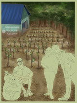
Having shown how the orangutans lived prior to the damaging effects of deforestation, to showing how they are effected throughout the process - without a home - I now wanted to use the third poster to really signify the importance of the Orangutan Foundation, what they offer and the hard work they put in. Reforesting destroyed land and working with local people is a significant part of what the Foundation do - I knew it was important to represent this within my outcomes. By also providing a representation of an Orangutan Foundation team member, I created the contrast of one in uniform, with two women as the local people, not. Focusing on the variety in ages and appearances of volunteers, I took inspiration directly from the Foundation's website.
Important elements I wanted to include and initially sketch out were;
- Showing at least one of the Foundation's physical three parks/reserves - Working with local people - Reforesting through the planting of new trees
- The beauty of how the rainforests should be - Growth of the orangutan population by showing a mother and her baby
The colours used across all three of the posters were selected as a result of inspiration from secondary images on the Orangutan Foundation website, or I took them directly from the colour palettes I had collected on a previous blog post. I wanted to represent the Foundation and their messages as specifically as possible. To showcase the positive energy and attitudes that come as a result of the Foundation and the impact they have on their own team, the local people and of course the orangutans, I had to provide happy, confident, wishful facial expressions - to show the future we want and are excited by!


Comments